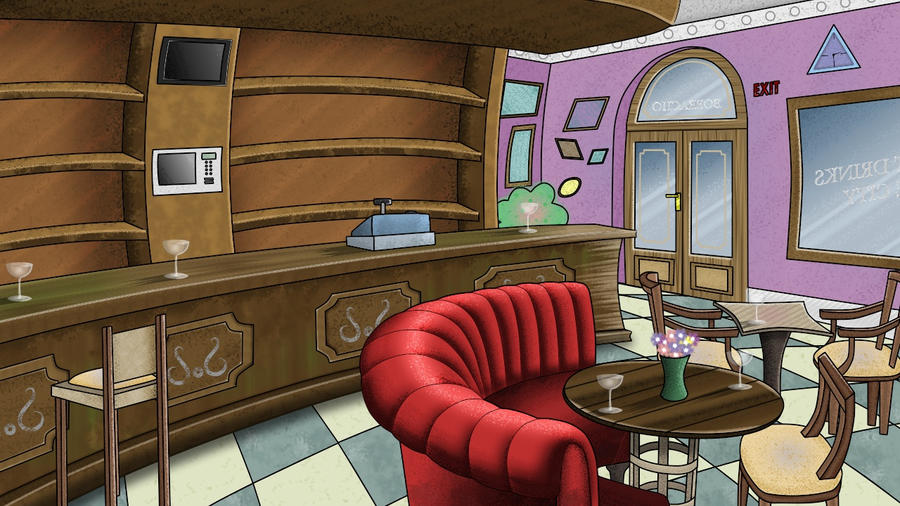
I feel that you're aiming for a certain dynamic (as opposed to solid perspective). You're bending lines and shapes but you don't do so consistently. That's why it looks "off kilter".
The composition should be based on a really simple idea. Just a couple of lines or colored shapes that dictate how everything in the final drawing should be.
Now here's something no artist likes to do (and I don't like to do it either) : a first sketch.

But it shows how to explore ideas that will lead up to the final drawing. There are at least 2 dozen things wrong with it but it's also clear why they are wrong. The whole composition is about that single sweeping arc. It just takes 5 minutes to draw such a thing. You can try out different arcs, lines, etc. to convey the emotion you want in the final drawing. Arrangement of props and furniture will be done in such a way that they strengthen the idea. They either follow the arc or will oppose it. I already can see that the sofa is placed wrongly and at a wrong angle (and the perspective is wrong to add injury to insult). The back wall with the door in it should follow a different arc to oppose the major one more strongly. Etcetera. And some stuff is needed to break up the composition. Something vertical in the foreground. Etcetera (I probably could have rattled off a couple more sketches in the time it took me to write this).
But apart from such things, the basic idea is already present : that big sweeping arc. Every decision will be based on that arc.
But don't overdo it. Or it can easily look as if the whole drawing is vacuum sucked into some black hole. Also : if you draw converging lines then the eye will travel to the point where they meet. Better put something there that opposes the motion and is of interest and will direct the eye back into other parts of the drawing. Add some variation and don't follow the lines of action too slavishly.
Think about big things in the drawing. Where are the lines heading towards? Where is the convexity (the bulging), where the concavity (the squeezing), the rhythm (like those bar stools), etc. These are purely graphical thoughts.
Well, one could easily write an entire book about the subject but it's best to just try it out and play with it.
Now, I mentioned action lines and they are normally associated with poses. But they apply to backgrounds as well.
Here I have a couple of heads. They work with action lines as well :

These are all from live action movies (guess the movies, folks). Of course, the people don't look anything like the way I've drawn them (it's bloody impossible in real life). The features are all stretched and squashed around simple lines of action to sell the expression better. That's the internal consistency of these faces, all lines follow a very simple idea. The same thing can be done to poses and backgrounds.


