Want to share your Moho work? Post it here.
Moderators: Víctor Paredes , Belgarath , slowtiger
walktoon
Posts: 42 Joined: Mon Aug 10, 2009 12:13 pmLocation: India
Contact:
Post
by walktoon Wed Dec 02, 2009 6:17 pm
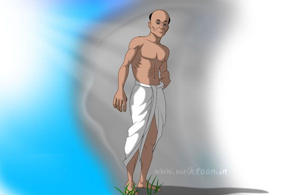
Please give suggestions for this character.
Last edited by
walktoon on Fri Dec 04, 2009 3:43 am, edited 1 time in total.
Genete
Posts: 3483 Joined: Tue Oct 17, 2006 7:27 amLocation: España / Spain
Post
by Genete Wed Dec 02, 2009 10:06 pm
Looks pretty good.
jwlane
Posts: 152 Joined: Tue Mar 28, 2006 3:29 pmLocation: Knoxville, Tennessee, USA
Contact:
Post
by jwlane Wed Dec 02, 2009 10:41 pm
I'd simplify the deltoid, oblique and ab muscles. I think less detail will look more natural in those places. I have to keep a mirror handy, myself.
Imago
Posts: 698 Joined: Wed Dec 10, 2008 12:48 amLocation: Sardinia
Post
by Imago Thu Dec 03, 2009 12:50 am
Ehi, it's good!
Sorry for my bad english... Q_Q
walktoon
Posts: 42 Joined: Mon Aug 10, 2009 12:13 pmLocation: India
Contact:
Post
by walktoon Thu Dec 03, 2009 10:03 am
Thanks to all for helping to come best result.
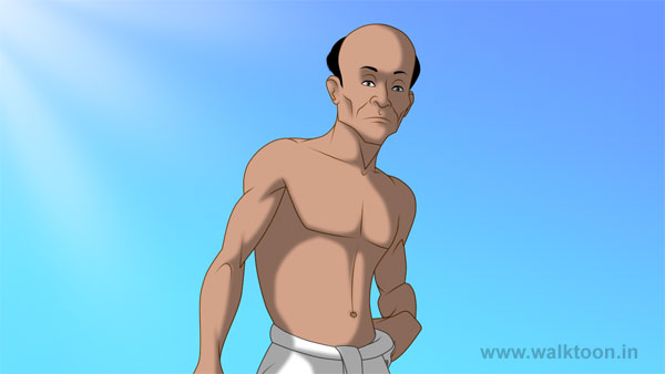
Modified character. Please give your suggestion for this.
Last edited by
walktoon on Fri Dec 04, 2009 2:51 am, edited 1 time in total.
neeters_guy
Posts: 1628 Joined: Mon Sep 14, 2009 11:33 am
Contact:
Post
by neeters_guy Thu Dec 03, 2009 10:18 am
You should make him a ninja...and also a turtle.
Nah, kidding. It's perfect.
Joppa
Posts: 58 Joined: Sat Dec 06, 2008 10:45 amLocation: Sweden
Post
by Joppa Thu Dec 03, 2009 12:11 pm
which techniques are you using for the shadows?
Genete
Posts: 3483 Joined: Tue Oct 17, 2006 7:27 amLocation: España / Spain
Post
by Genete Thu Dec 03, 2009 1:58 pm
The correction on the hair makes his head look better.
I prefer the more detailed chest like in the first image. Anyway the drawings are quite good. Some animation would make it more interesting
-G
Víctor Paredes
Site Admin
Posts: 5868 Joined: Tue Jan 25, 2005 3:18 pmLocation: Barcelona/Chile
Contact:
Post
by Víctor Paredes Thu Dec 03, 2009 2:05 pm
It's a beautiful work, walktoon. I just think the left arm is a little weird, it looks as if it were just scaled by the bones, maybe a little of point accommodation could improve it.
walktoon
Posts: 42 Joined: Mon Aug 10, 2009 12:13 pmLocation: India
Contact:
Post
by walktoon Fri Dec 04, 2009 2:49 am
Thanks to all for your nice comments and guidance.
I hope this will be better. Please give suggestions for this character.
Just masking is used for the shadows. Black color is filled all the shapes in the masking layer. Layer Blur radius is 3 and the Opacity is 35%
J. Baker
Posts: 1143 Joined: Wed Mar 23, 2005 10:22 amLocation: USA
Contact:
Post
by J. Baker Mon Dec 07, 2009 11:02 am
Nice work!
Here's a quick edit...
walktoon
Posts: 42 Joined: Mon Aug 10, 2009 12:13 pmLocation: India
Contact:
Post
by walktoon Tue Dec 08, 2009 2:12 pm
Thanks a lot J. Baker...
J. Baker
Posts: 1143 Joined: Wed Mar 23, 2005 10:22 amLocation: USA
Contact:
Post
by J. Baker Tue Dec 08, 2009 8:45 pm
walktoon wrote: Thanks a lot J. Baker...
No problem, you're already doing a wonderful job. Keep up the good work!