So, here's another aesthetic question, as opposed to an AS problem. I have a character with a partly black outfit. What's a decent way to have detail, if my outfit's already black? If it were any other color, I'd use black lines to show musculature, etc.
From my comic book viewing days, I recall how they'd use "edge lights", stroking the edges of an arm or leg with blue or red or whatever color the lights in the rest of the scene were supposed to be, to show detail, and I remember Batman's black outfit had very little actual black in it when drawn. Lots of blues and greys.
Without doing anything insanely elaborate, is there a way to make a black outfilt less of a black mass of nothingness? If I can't think of anything else, I guess I can stroke the edges of each limb, etc., with an appropriate color.
detail on black clothing
Moderators: Víctor Paredes, Belgarath, slowtiger


In a character like Daffy Duck white outlines were absolutely necessary to define the body, but they used it only where a black arm was in front of the black body, not as a general outline. This alone would create some difficulties in AS ...
It depends on your style. Is the all-black look absolutely mandatory? Can't you use a different colour for the sleeves, the neck, the hips? As you say, you want to accentuate the boobs. So think of why your character chooses black over big boobs? Does she want to hide them? Then you should do the same. Does she want to accentuate them? Then don't use black.
Overall I'd like to see much more variety in cartoon character's clothes. Today it's either military or skin-tight. I don't know about USA, but in german cities I see much more variety on the streets.
The notion that ink looks best color-coordinated with fill color applies in a twisted way to those two non-colors, black and white.
Don Bluth's artists would outline black with a kind of antique gold (mustard-biege, or whatever). I bet this was originally a Disney tradition.
It looked spectacular.
However, I'm not sure that they ever really allowed true black into their palette in the first place. I have this feeling that they used deep charcoal greys instead.
Or maybe that's just because it's what I like.
Pure black and pure white? For the most part, yuk, who needs them.

Black is never "black". It is always made up of shades of gray or blue or pick up colors from what is around it. Unless it is a totally black material that absorbs all light and has no surface properties at all.
Make the black just... not quite all the way black... very dark gray. Then use lighter shades of gray or white for highlight strokes and black for shadow strokes. It will still look black. Unless you are going for a stylized silhouette effect.
100% black is going to be... well... 100% black. There is no way to have darker shadows on a 100% black surface.
Even white is not white. Light gray with white highlights and gray shadows.
p.s. Reminds me of an episode of "Father Ted", when Father Ted and Dougle are discussing how black their priests socks really are.
-vern"Some priests socks aren't really black, they are just very very very very very VERY dark blue."
Thanks, gents. Surely one of these methods will work for me. These characters don't really have shadow/highlight detail; they're very simple looking (think simpsons, family guy, etc. They only use highlights and shadows in certain scenes where it accentuates a mood, but they mostly remain flat). I'm afraid the Father Ted reference is lost on me. . .I'm too young, too ignorant, from the wrong part of the world, or all three. Or two of the three.
Okay, so I like keeping the black absolutely black. If I make the black even 50,50,50 (in the color picker), it's too washed out looking. 25,25,25 is too close to black and you can't really see the difference between that and real black.
I like the way a lighter grey outline looks (about 70,70,70) around the black parts, but the way I've done everything else, everything has black outlines, so I'd have parts of one character that have a different color outline compared to the rest of the project.
I think what looks okay is to have the black outline, and then a SECOND, light grey outline inside it. So two outlines, like a goth rainbow. Ha. I'll have to clone the shape, shrink it, give it a new outline, lay it over the original wherever I use this method.
Either that or just leave it pure black and live with it.
-
toonertime

- Posts: 595
- Joined: Mon Feb 26, 2007 11:34 pm
- Location: ST. LOUIS
an immodest proposal
i was thinking you could have, like some
tears in her black t shirt where her
nipples are, and, like they could
be popping out.
tears in her black t shirt where her
nipples are, and, like they could
be popping out.
-
synthsin75

- Posts: 10490
- Joined: Mon Jan 14, 2008 2:20 pm
- Location: Oklahoma
- Contact:
-
funksmaname

- Posts: 3174
- Joined: Tue May 29, 2007 3:31 am
- Location: New Zealand
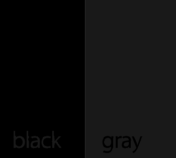
I'm on a mac, actually. It's an Imac, and the contrast of the screen changes depending on your eye level. I guess that could be problematic. For the record, yes, I can see the difference between the two sample swatches you posted, but it's not much (to my POV, unless I stand and look down at my monitor from a severe angle that makes all the other colors go all crazy), and you have to examine it closely to see it. I'm thinking of how you wouldn't be able to discern it while watching a character move around, and whatnot.
PS just went through the calibration process, so thanks for that.
PPS Okay, I tried the halo thing. . .obviously I'm doing something wrong. When I set up the halo, I get it the way I want it, and then make it part of the style that I apply to the "black" parts of the clothing. I don't see the effect, though, still looks pitch black everywhere. I thought maybe it was one of the effects you only see upon a render, so I did the single frame render, and it still doesn't show up. What am I missing? Do I want to apply the halo to the fill or the outline?