http://www.youtube.com/watch?v=8DUtNHVBB98 (The english version will be available on Thursday.)
All scenes where done in AS. The character drawings were done in TVpaint, the props I painted with ink and a chinese brush on paper. Colouring effects and typography were done in Photoshop. The BG was one single watercolour wash on paper which I processed in PS to get different colour versions.
Editing done in Final Cut, music and sound processing in Logic. Production and upload format was 1280 x 720, 30fps. The file I uploaded to youtube was 226 MB big, an .MP4 with a data rate of 6400 bit/sec, for those who want to try this setting. I'm quite satisfied with the YT quality.
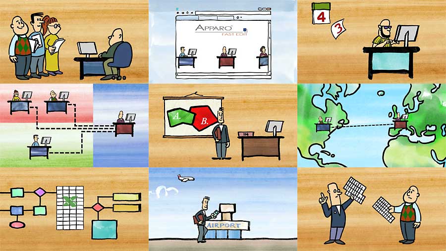
I would've preferred a longer production time, but the film is to be presented on Tuesday. Fortunately this client is a very reasonable one who doesn't demand many changes, I basically worked from a very rough storyboard I presented to him and added things while going along. You will of course notice the many re-uses of stuff. The purpose of the film is to explain the product (a software) to execs who don't understand the technical details.
I set up all scenes in v5.6, but rendered in 5.6 and 6.1 in parallel (on the same machine) to save time. Production files ate up as much as 16,5 GB of disk space - because all scenes were rendered in full resolution and PNG codec, and because the artwork was hi-res as well.
I made some observations during this tight production.
1. It was too tight. I didn't have the chance to just drop the work for 2 days, then look at it again with a fresh eye. This was especially true with the soundtrack, where I was completely off the track with my music first. Fortunately some weekend visitors had a look and gave good advice.
With just one additional week I could iron out some minor mistakes, add some two or three drawings, and maybe change the sequence of scenes a bit (and skip one). Then it would be really polished. Right now it's just "good enough". At least it looks much more expensive than it was.
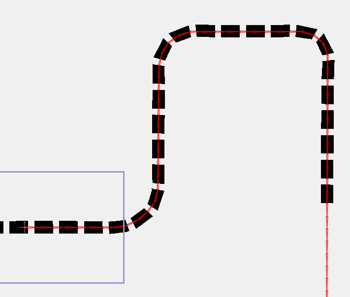
2. It pays to prepare stuff in advance for re-use. The dotted line was created only once, of course, as well as the walks. It's only one BG, basically. The typing fingers have been done only once as well, and then coloured differently.
3. Use different programs to combine their benefits and avoid their weak spots. Drawing these characters in TVP was fastest, like doing all those pans in AS - no other program beats it in this discipline. The self-drawing diagram was done in TVP: start with the whole thing, then work backwards and erase bit by bit - fastest way to do so.
4. Do stuff in the correct size from the beginning. This way I was able to re-use character movements from an early scene, but still could add additional drawings without having to adjust sizes.
5. Use groups. They're such a time saver! A typical scene had one root group layer which held all stuff, and this group was moved for all camera moves (I prefer this over camera moves because I have more control over movements). In this I had groups for each character and his desk, where the character had some switch layers. As a rule, I did all size changes on the highest possible level, so if there were 12 dotted line groups I put them into one group and scaled only that.
6. Use masks. The dotted lines where done that way as well as all those logos-inside-boxes. (The dotted line was made with 2 layers and 2 keys.)
7. Set your origin points carefully. The green filling rectangles where done with layer scaling, not point motion.
8. Animate first, then multiply that layer and adjust animation in time.
Overall this was fun. I had the chance to use a favourite style of mine, a bit like the advertising films from the 50's and 60's. I definitely should draw more with ink and brush, it's fast and expressive, and it makes for a strong image on screen.