Improved Rendering - coming soon

Discuss ideas for new features with other users. To submit feature requests to Smith Micro, please visit support.smithmicro.com

Moderators: Víctor Paredes, Belgarath, slowtiger

User avatar
Lost Marble
Site Admin
Posts: 2355
Joined: Tue Aug 03, 2004 6:02 pm
Location: Scotts Valley, California, USA
Contact:

Improved Rendering - coming soon

Post by Lost Marble »

The issue of rendering quality has come up several times regarding line quality, the display of small shapes, etc. While I don't normally announce features in advance, I can tell you that rendering quality will see a huge improvement in the next update of Moho.

The reason I'm revealing this improvement in advance is that I'd like to get some feedback on how it's working. To try it out, download the following file, extract it, and replace your copy of moho.exe in the Moho program folder. (You may want to keep a copy of the old moho.exe in case you want to go back to it.) This file is a new version of Moho (Windows only right now) with the new renderer:

http://www.lostmarble.com/misc/render_q ... 2.1rt2.zip

What I'd like for you all to try is to open your existing files and try rendering them. Does the quality look good? Are there any apparent mistakes in the rendered output?

One of the changes is that the new renderer is able to correctly draw very thin lines. This will make your existing files render differently than they did before. Is this a good thing, or should Moho add some extra width to the lines in old files to get them to appear the same when rendered with the new renderer?

Basically, any feedback you may have is welcome - just add it to this thread.

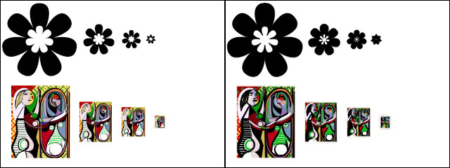
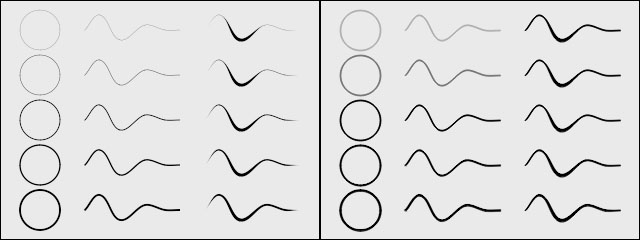
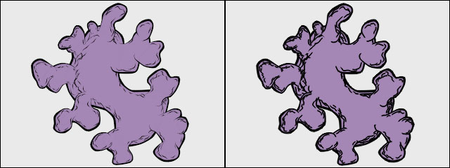
Now some examples of the improvements. In every picture below, the left image is from the new renderer, while the right image is from the old one (the current version of Moho - 5.2.1).

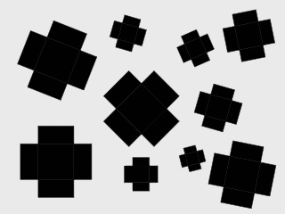
Moho used to have a problem with shapes that are very small, or become very small in the process of scaling or camera moves. As you can see, the new renderer is better at maintaining shape definition at small sizes. In the past, small shapes would get "mushy":

Image

The new renderer also allows fractional line widths. In the picture below, the rows from top to bottom use line widths of 0.25, 0.5, 1, 1.5, and 2. The third column in each picture shows lines with variable thicknesses. In the old renderer the differences are not very clear:

Image

The improved rendering of lines makes the Freehand tool more expressive:

Image

And the combination of improved shapes and lines makes imported Illustrator artwork much more accurate:

Image

Please download the test version of Moho above and let us know what you think.
Last edited by Lost Marble on Wed Nov 23, 2005 5:52 pm, edited 1 time in total.
User avatar
Rai López
Posts: 2292
Joined: Sun Aug 08, 2004 1:41 pm
Location: Spain
Contact:

Post by Rai López »

:shock: ...Definitely a good moment to take out this --> :mrgreen: :mrgreen: :mrgreen: And well, let's asume this is not a dream... (not totally sure yet :roll: ) This can be the very best new that I have had in a long time!!! :D THANK YOU!!! Definitely Moho has been walking lately to the perfection step by step but this is a GIANT step! I can imagine a whole new world of possibilities/styles and, although means for me make some changes and new decissions, I'll be very happy to invert some time and work in my proyects to addapt'em and take benefit of this GREAT advantage :D ...I remember that in the past, I decided design my characters using a very thick line cause get thin lines all the time were simply impossible, but I never was very happy with that results, cause the decision was not really a decision but an imposition... With this IMPROVEMENT I'll be free to make all as I have in mind and this is very important in a program like this... Well, now I'm going to try/enjoy it more :) and then I'll put here more impressions and thoughts :arrow: THANK YOU again LM to make our DREAMS come true! :mrgreen: *CIAO*

PS: ...Very HAPPY to be the first here (PLUS)! :D
Last edited by Rai López on Wed Nov 16, 2005 9:10 am, edited 3 times in total.
User avatar
Rai López
Posts: 2292
Joined: Sun Aug 08, 2004 1:41 pm
Location: Spain
Contact:

Post by Rai López »

By the way, a very good oportunity to add a little numeric box to the Line Width tool to can have total control over aparence of the line :) , copy exactly Line Width between points, etc... Just like the 7feet Curvature tool has but for this one... I'd be more P-E-R-F-E-C-T (if possible...) 8) And another thing... I have been trying the new line aparence working with Brushes and seems that Brushed lines still dissapear suddenly in the distance or de-scaling works... It'd be this improved too in the final version or in the future? Very IMPORTANT thing but SO happy anyway... :D

EDIT: *IMPORTANT* Talking about Brushes ...Seems that when I apply a brush to my black/colored lines, they become totaly WRITE in Render view, bug?
User avatar
Lost Marble
Site Admin
Posts: 2355
Joined: Tue Aug 03, 2004 6:02 pm
Location: Scotts Valley, California, USA
Contact:

Post by Lost Marble »

Sorry, I forgot to mention that brushed lines don't work correctly right now. They will work when this next version is finished, but not in this render test.
User avatar
Rai López
Posts: 2292
Joined: Sun Aug 08, 2004 1:41 pm
Location: Spain
Contact:

Post by Rai López »

WOW! THANK YOU LM! :D I think that if finally Brush lines looks SO great as the normal line in this Render Test I'll surely have a... HEART ATTACK!

PS: Jaja, and SORRY... but I've discover right now that new "Gap Filling" check box in Vectors "Noise Settings" tab and I can't avoid start to DREAM... :roll:
User avatar
MarkBorok
Posts: 184
Joined: Sat Aug 14, 2004 8:45 pm
Location: Providence, RI
Contact:

Post by MarkBorok »

WHOA!

There are only two things that have kept me from recommending Moho without reservations to every animator I know; rendering quality and lack of control over the motion graph. Of these I figured rendering quality would be the more difficult one to fix. One down one to go.

Wish I had a Windows machine to try these out on.
teotoon
Posts: 133
Joined: Wed Aug 04, 2004 7:19 am
Location: Turkey

Post by teotoon »

Dear LM,

This is absolutely fantastic! Thank you for the great job. One question: Will there any improvement in the 3d rendering?
User avatar
gochris
Posts: 50
Joined: Mon Aug 09, 2004 10:30 am
Location: Los Angeles

Post by gochris »

Bravo!

I'm always impressed at how responsive LM is to user's needs.
User avatar
ulrik
Posts: 1087
Joined: Thu Aug 11, 2005 10:32 pm
Location: Stockholm Sweden
Contact:

Post by ulrik »

That sounds great LM :D , does this mean it will also be possible to see the drawing rendered in real time? with brushes, outline thickness, drawing effects...etc.?
User avatar
Squeakydave
Posts: 328
Joined: Tue Aug 03, 2004 9:44 pm
Location: UK - London-ish
Contact:

Post by Squeakydave »

What a present to recieve on my Birthday!
I've done a quick test. The rendering is MUCH improved but still not as good as the flash export.
I'll send you a mail with a test file off list.
User avatar
gochris
Posts: 50
Joined: Mon Aug 09, 2004 10:30 am
Location: Los Angeles

Post by gochris »

Happy birthday, Dave.
User avatar
jahnocli
Posts: 3471
Joined: Fri Oct 29, 2004 2:13 pm
Location: UK

Post by jahnocli »

Bravo! Oh, and Happy Birthday, Dave!
You can't have everything. Where would you put it?
User avatar
Rai López
Posts: 2292
Joined: Sun Aug 08, 2004 1:41 pm
Location: Spain
Contact:

Post by Rai López »

Squeakydave wrote:The rendering is MUCH improved but still not as good as the flash export.
I'm not familiarized with flash but, are you refering to the Moho Antialias issue, seems that Moho Antialias tends to pixelate a little shapes and Outlines, yes... But, as I've said I always have worked with rastered images programs like AFX or Combustion and I don't know very well how other vector based programs Antialias works...
User avatar
Lost Marble
Site Admin
Posts: 2355
Joined: Tue Aug 03, 2004 6:02 pm
Location: Scotts Valley, California, USA
Contact:

Post by Lost Marble »

I just sent Squeakydave a modified version of his file that renders at the same quality (I believe) as Flash. I'll let him comment on the result, but I thought I should share the details with everyone else here.

Part of the improved rendering is a function in Moho known as "gap filling". When you have two shapes that line up exactly along their edges, it can be possible to see tiny gaps between them. These gaps are actually less than a pixel wide and show up as a lighter color along that shared edge. To combat these gaps, Moho draws fill shapes slightly fatter that they are supposed to be. This fills the gaps, but makes small shapes appear poorly-defined or "squidgy".

The new renderer reduces the amount of fatness applied to the shapes, making all shapes look better. But it also gives you the option of turning off gap filling completely. For Squeakydave's file I turned it off by double-clicking each vector layer, going to the Vectors tab, and turning off "Gap filling".

The big question is if this feature should be on or off by default. In the Edit->Preferences dialog, you can choose to turn off gap filling for all new layers, but right now Moho turns it on whenever it opens an older file to maintain some kind of visual compatibility. What do you all think, should gap filling be on or off for old files? It could also follow the Preferences setting when opening old files.

In most Moho artwork that I see on this forum, gap filling is not necessary, and turning it off wouldn't hurt anything (and in fact would improve quality). The reason it's on by default is that it seemed easier to explain to experienced users how/why to turn it off than to have less-experienced users get surprised by occasional gaps between shapes.

Here's an example file. This file was constructed specifically to exacerbate the gap problem - it isn't typical of most Moho artwork. Gaps visible:

Image

Gap filling turned on: (Yes, if you look closely, some gaps are still visible. Gap filling may need some more tweaking, but like I said, this is a worst-case situation.)

Image
User avatar
Lost Marble
Site Admin
Posts: 2355
Joined: Tue Aug 03, 2004 6:02 pm
Location: Scotts Valley, California, USA
Contact:

Post by Lost Marble »

A little more about gap filling:

My previous post was a bit long, and I don't want anyone to think gap filling is a complicated issue or something you need to worry about all the time. The simplest way to think about it is this:

Just leave the option on all the time and don't think about it. Then, if you have some very small shapes that don't look as well-defined as you would like, try turning off gap filling for that vector layer.
Post Reply