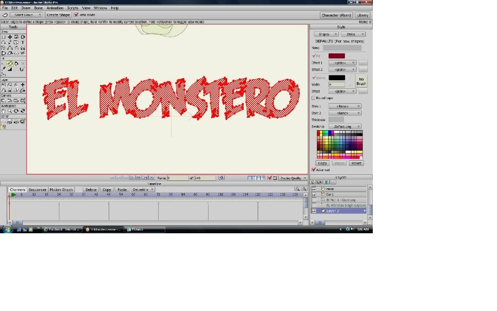
As far as I can see, there seems to be some inconsistencies on some curves (or part of them) which are preventing the correct filling of the shapes/s. Just as an example, the first "
EL" can be separately filled as soon as you doesn't include the smaller of the two little holes at the bottom of the "
E" in the filling process, erm... don't ask me way, cause it seems to be well closed and constructed as a continuous one curve, but there it is. I have observed too that you have not joined letters as an only one continuous curve and, although it doesn't seems to be the real problem here, it's always advisable to do it (when possible, as seems to be the case) just in case.
Anyway... instead being merging and making-up curves in order to fill all the text with only one unified shape (for which you can have your own reasons, of course), wouldn't you simply prefer uncheck the "Stroke" and the "Create one shape" options in the "Insert Text" window, add then manually a simple stroke to ALL the text and "Lower (it) To Back" to
fake a similar unified effect? Not a solution to the problem itself, I agree, but easy & quick at least. Otherwise... I think it'd require to detect one by one all the possible problems in order to ensure a legal shape.
Well, you can see/study the results of the above described method and decide if it can fit your needs:
http://db.tt/XbUvA5e1
PS: BTW, I liked that font!

...

